In Part 1, we have talked about the hardware/software running on the edge (the car) for collecting data.
Now we have the data, and how to gain some insights by doing data analytics? I have been using the following products, and would like to share my quick thoughts
- Azure Time Series Insight (TSI)
- Azure Databricks
- Azure Data Explorer (ADX)
- PowerBI
- Grafana
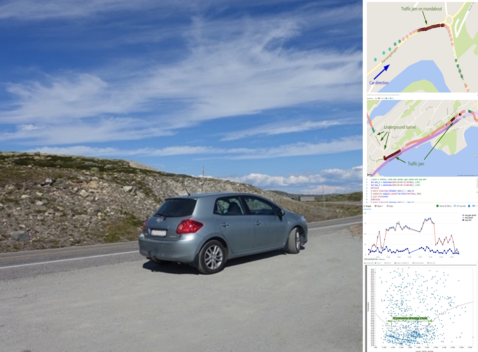
Please note that I tested these products back to Feb/March of 2019 and all the feedback were from that time point. I am sure all products were significate upgraded and improved since then, so you might wanna check them again with the lastest features.
1. Azure Time Series Insight (TSI)
Azure Time Series Insight (TSI) is an IoT analytics platform monitor, analyze, and visualize your industrial IoT data at scale. With native integration with Azure IoTHub or EventHub, it is easy to visualize and explore the IoT data such as from our connected car.
1.1 Simple data exploring
You can easily explore data by putting time series data into one screen:
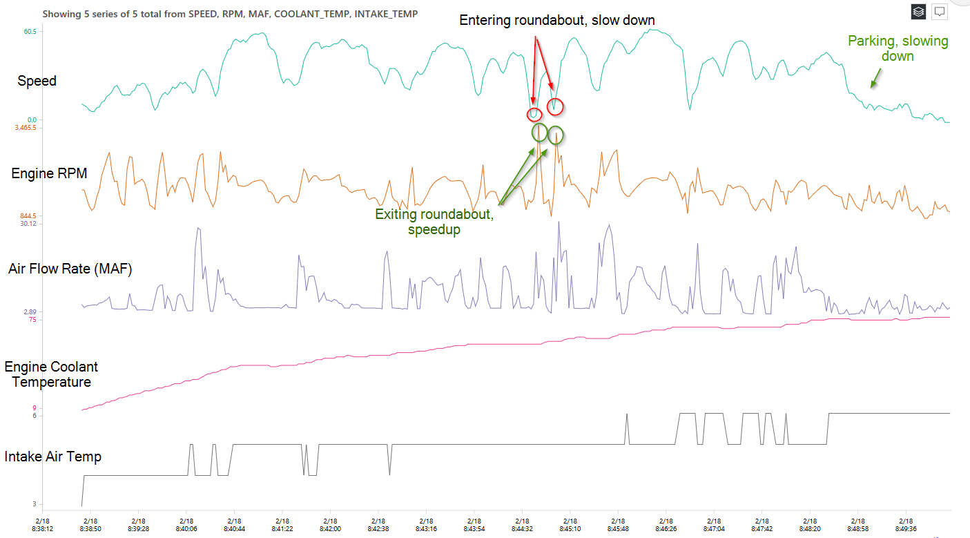
(click to enlarge)
For example, you can identify the relationship between engine RPM and speed, and the increasing temperature of engine coolant.
1.2 Metadata/Model management
As TSI is built for handling IoT data, it has built-in functionality for managing metadata/models of IoT data stream. This is a unique feature that only TSI offers, compares to other general-purpose analytics products that I tried.
In another word, in order to use TSI, you will have to setup the following models:
- Time Series Model instances
- Time Series Model hierarchies
- Time Series Model types
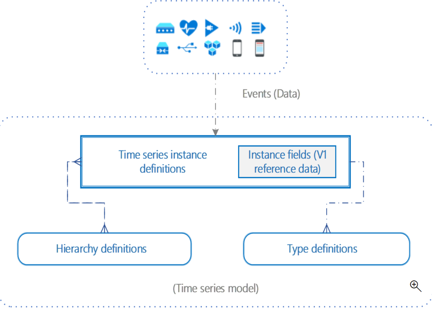
(source: Microsoft)
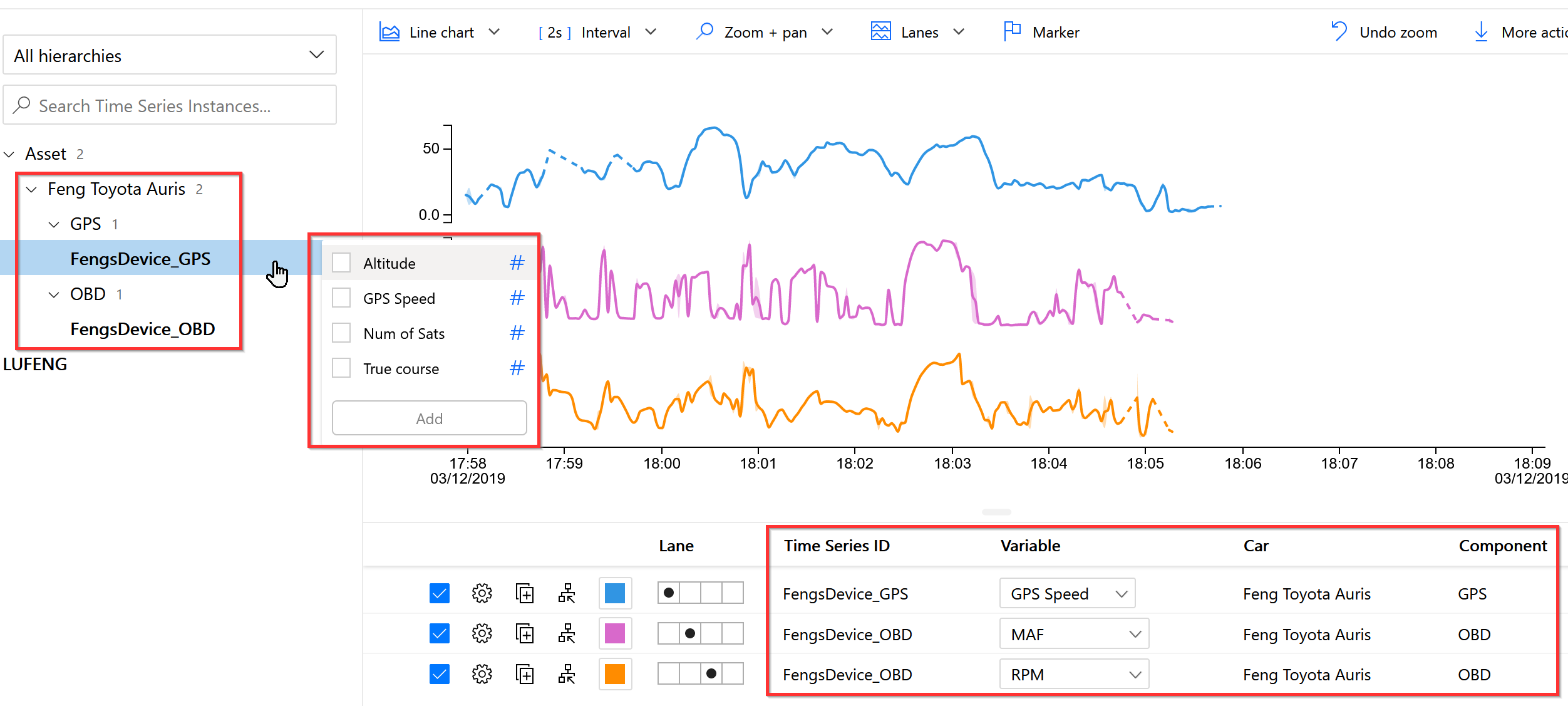
For our case, we can setup the models for representing the
1 | Assets - ABC Taxi Company Carpool |
For our case, these model definitions can be found at here.
1.3 Summary of TSI experience
Pro:
- Very nice user interface with animation, smoothly zoom in/out
- Built-in support of data module/metadata
- Supporting IoT data in scale (although I only tested with a small dataset)
- Data can be exported to parquet files, which is optimized for time-series data
Con:
- Limited analytic possibility, cannot run customized query in UI
- Does not support map
- Data model contextualization is done only via TSI API, not in parquet file (which is raw data)
- Exported parquet file is somewhat messy (see more details in DataBricks section)
2. Azure Databricks
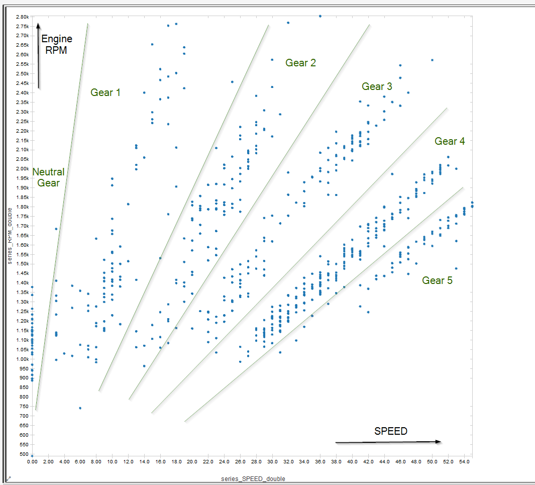
It was nice to visualize the time series data in TSI, but I would like to play more with the dataset, such as calculating the fuel consumption vs. speed for example. I would like to use python and jupyter notebook. Therefore I continue the work with Azure Databrick.
2.1 Simple plot of Speed vs RPM
2.2 Calculate the fuel consumption and eco-driving zone
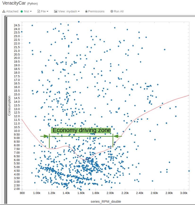
By using MFA and speed, it is possible to calculate the fuel consumption, as explained in https://www.windmill.co.uk/fuel.html and https://www.wikihow.com/Convert-MPG-to-Liters-per-100km.
1 | # Adding MPG column |
(Picture: Oversimplified calculation of eco-driving zone)
2.3 Issue of TSI generated parquet files
If we directly use the TSI parquet files as input for the databricks, we will encounter an error message “Found duplicate column(s) in data schema: “series_speed_double”.
This is because both GPS and OBD modules are reporting speed, but with different case “Speed” and “SPEED”.
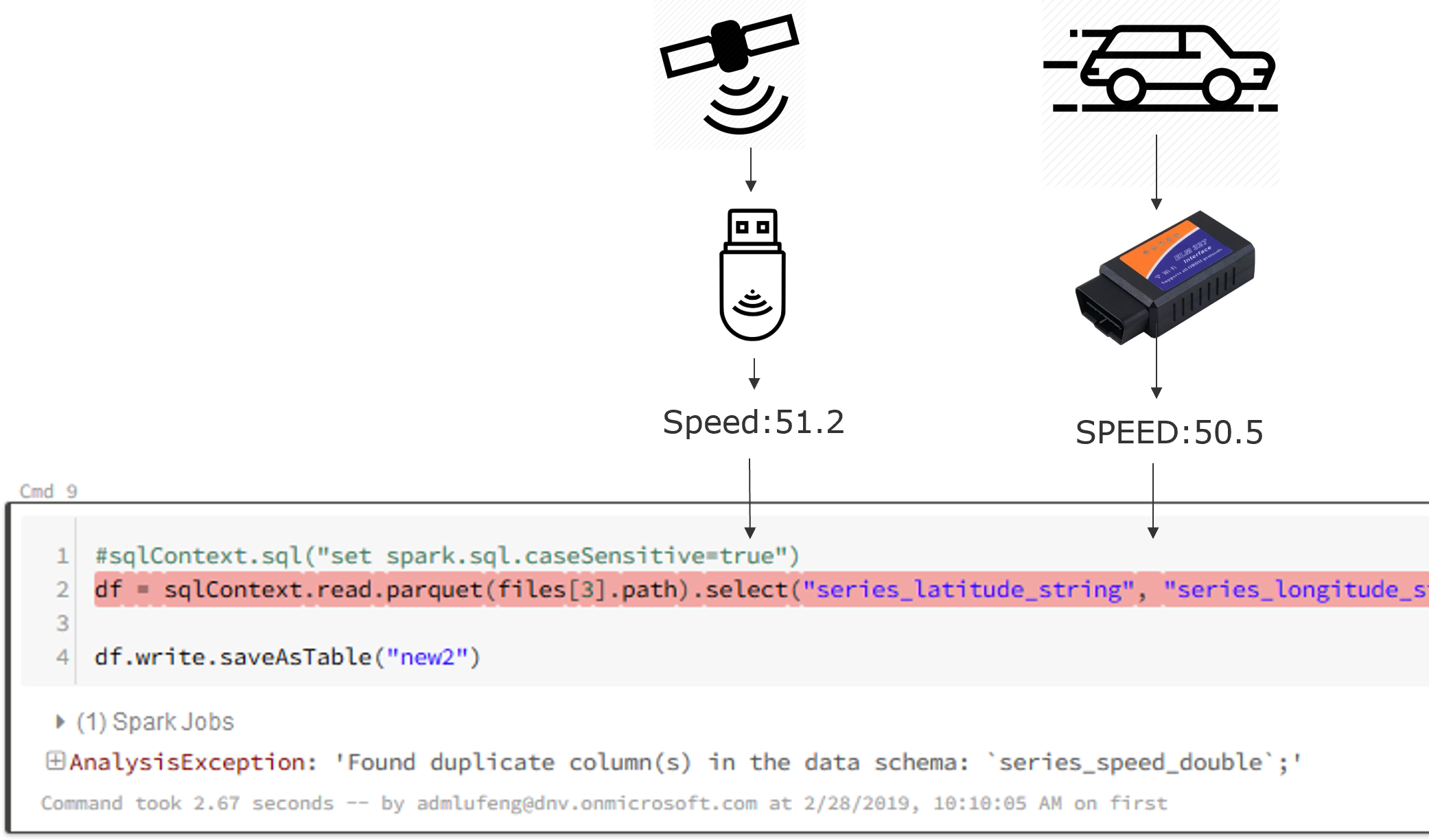
TSI is fine with it, as the asset model/metadata helps, but in Databrick there is no data contextualization - all data fields are flattened out, therefore it is quite often encountering this type of issue.
As a workaround, we can set spark.sql.caseSensitive as true
1 | sqlContext.sql("set spark.sql.caseSensitive=true") |
2.4 Summary of Databricks experience
Pro:
- The standard tool/eco-system for data analytics, can do almost anything
- Rich and powerful libraries
Con:
- Not for ordinary business users who do not work with python/programming
- Some visualization such as map and animation requires extra work
- Tried PowerBI to databricks (spark), did not manage to make it work at that time (beta version)
- No builtin data contextualization support, take the input as it is, which is an issue with TSI parquet files
3. Azure Data Explorer (ADX)
After tried the a-bit-too-simple TSI and a-bit-too-hardcore Databrick, I was looking for a better-balanced product between them. Therefore I started exploring Azure Data Explorer (ADX).
3.1 Setup database and ingestion mapping
Long story short, I created an ADX cluster and a database for IoT Car data, created 2 tables:
1 | .create table OBDTable (timestamp: datetime, deviceId: string, speed: real, rpm: real, run_time: real, absolute_load: real, short_fuel_trim_1: real, long_fuel_trim_1: real, timing_advance: real, intake_pressure: real, intake_temp: real, throttle_pos: real, relative_throttle_pos: real, oil_temp: real, maf: real, coolant_temp: real, engine_load: real) |
And create mappings as below:
1 | "Name": GPSMapping, |
3.2 Data analytics by using kusto query language
Now we are ready to query by using powerful kusto query language, especially the timeseries related analytics.
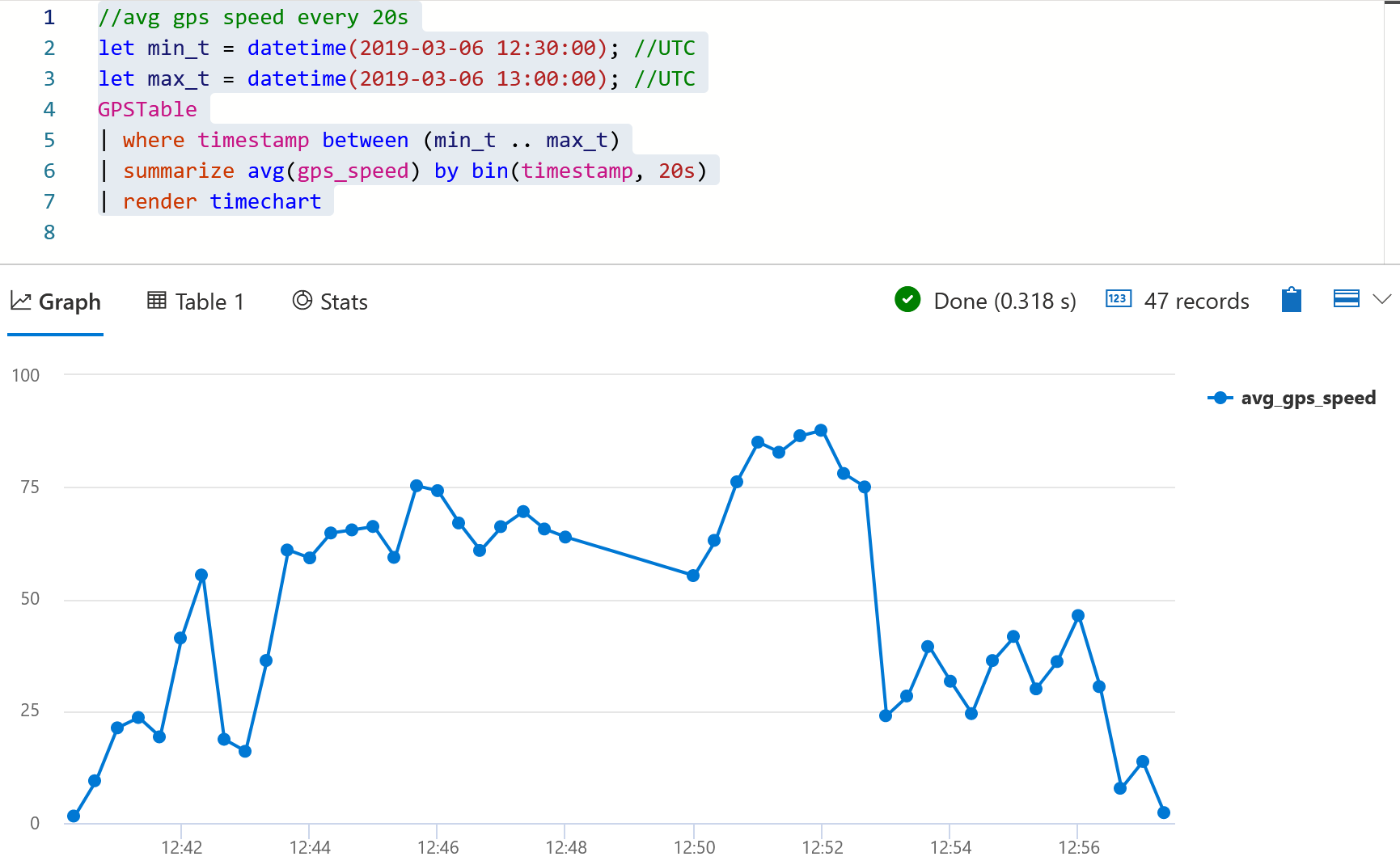
3.2.1 Average GPS speed aggregated by every 20 seconds
Simple data aggregation
1 | //avg gps speed every 20s |
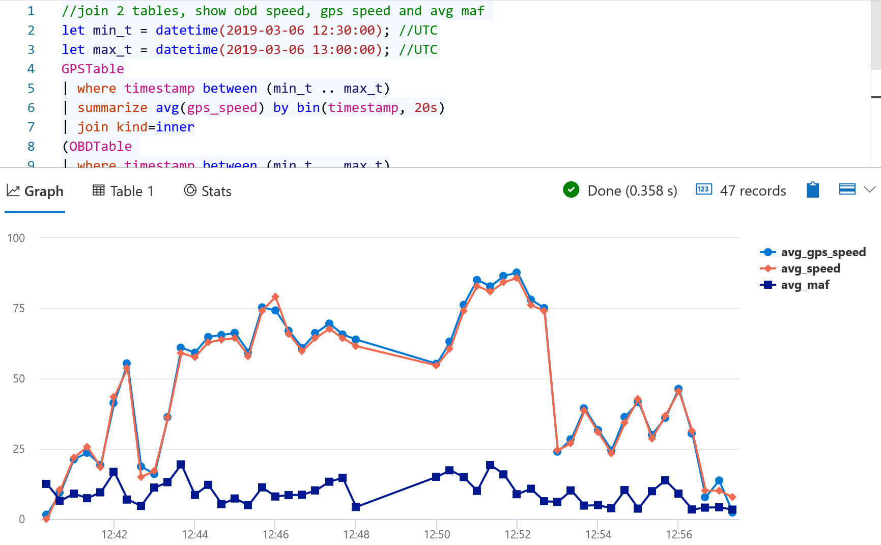
3.2.2 Join 2 tables, Show obd speed, gps speed and avg MAF
Inner join two tables and apply aggregation
1 | //join 2 tables, show obd speed, gps speed and avg maf |
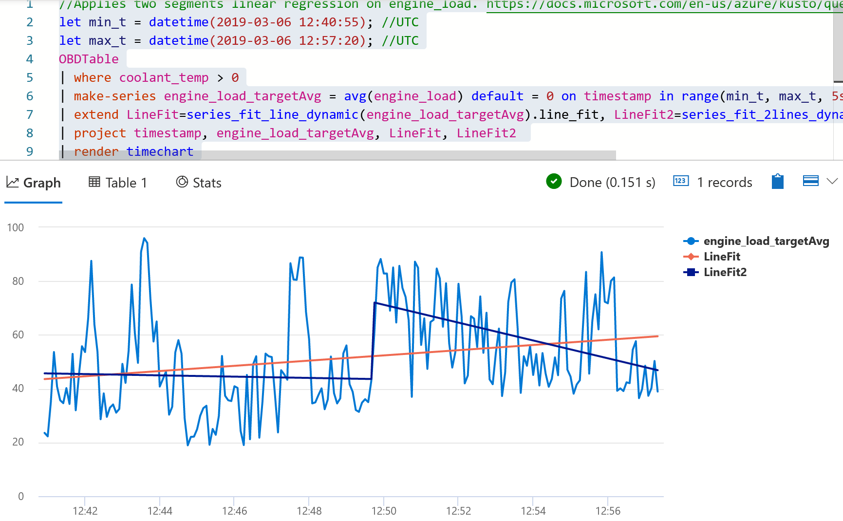
3.2.3 Applies two segments linear regression on engine_load
Apply two segments linear regression on engine load, see the document here.
1 | //Applies two segments linear regression on engine_load. |
3.3 Summary of ADX experience
Pro:
- Easy and powerful kusto query language, good balance between capacity and user-friendly query.
- Powerful and proven data computing capacity (the same technology that powers Azure log)
- Contextualization in storage (table and columns)
- Works well with PowerBI (see PowerBI section)
Con:
- Cannot replace the “real” big data products
- It has its own query limits
- Missing some visualization such as map and animation
4. PowerBI
So far I have tried several products for analytics, but none of them have great built-in visualization features, especially on map support.
PowerBI is a popular tool for data visualization, but it does not support big data analytics. However, by combining PowerBI and ADX, the job is easier.
4.1 Let ADX to handle the computing part
Instead of doing the visualization in ADX, now we use a query to generate a dataset (two dimensional table)
1 | //for powerbi map, CANNOT have comments! |
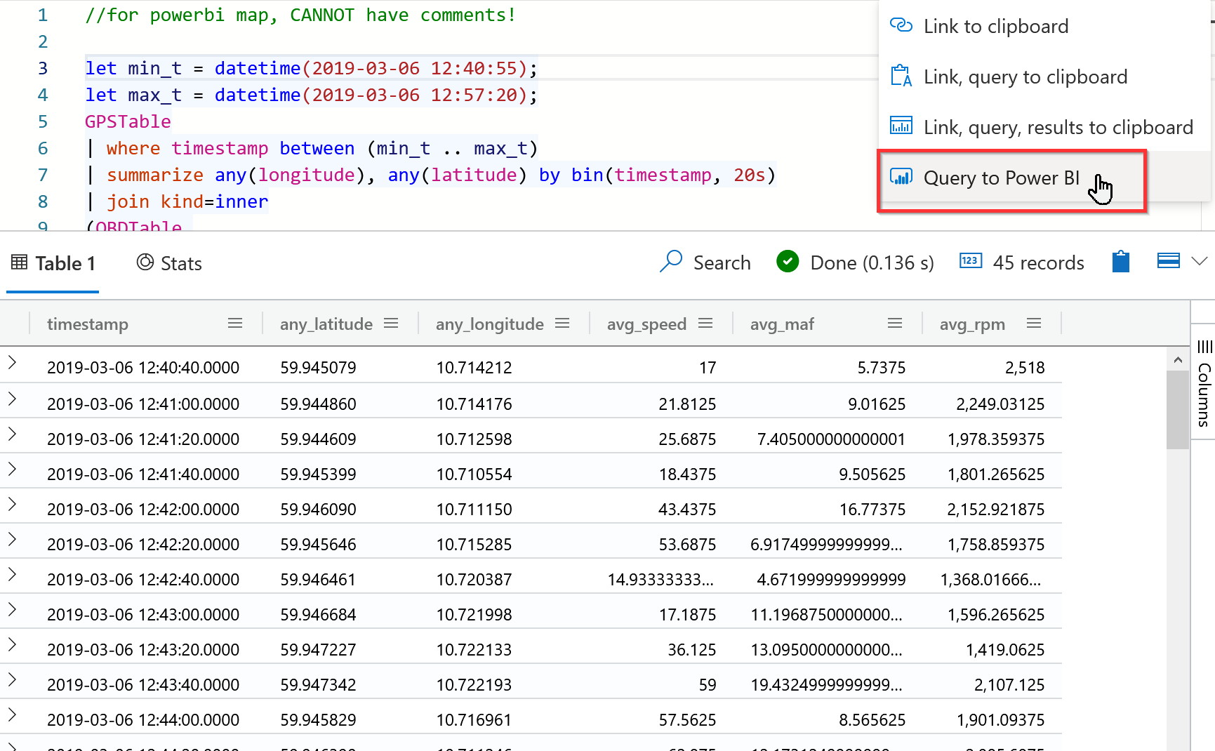
Then use “Query to PowerBI” on the dropdown list.
NOTE: When I was testing this, there was an issue that the Kusto query can NOT have inline comments, otherwise these inline comments will be mixed into the generated powerBI query, which ruined the syntax. Keep all the comments out of the kusto query block.
4.2 In PowerBI, create good-looking visualization dashboard
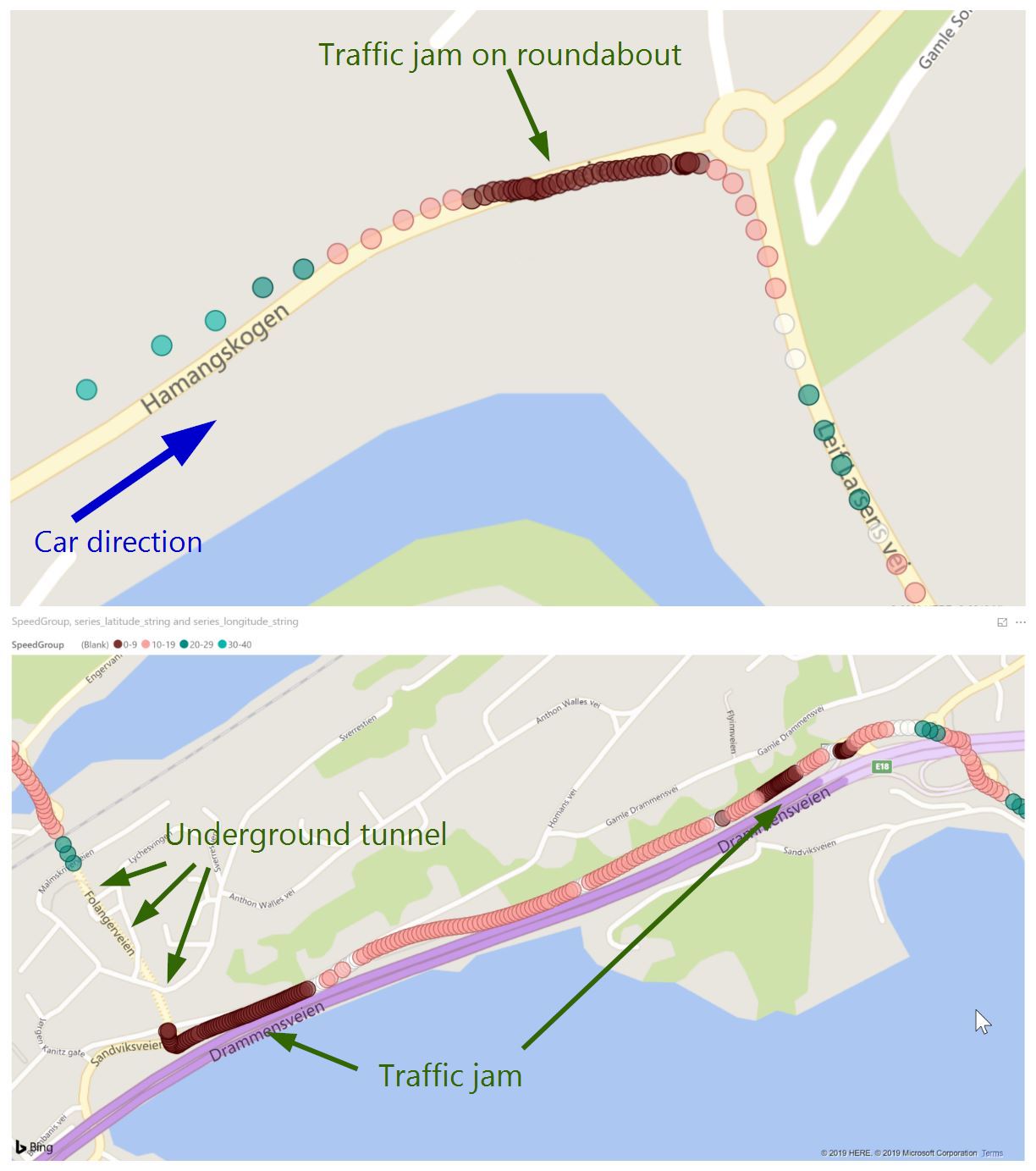
By using the generated PowerBI query from above, I can easily create differnt visualization dashboard in PowerBI. For example the map:
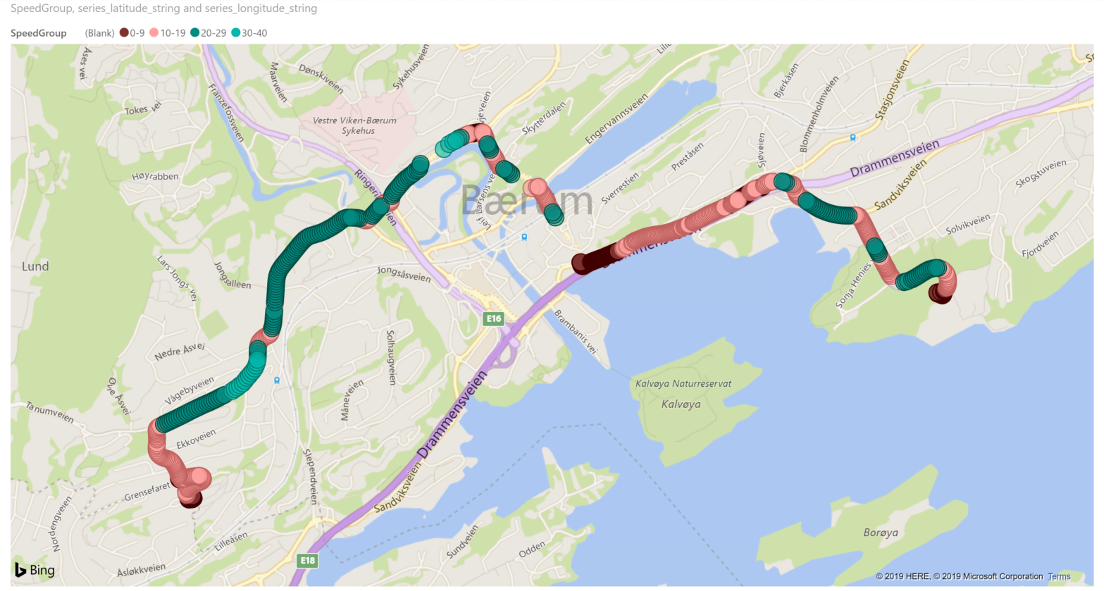
It shows one of the trips on the map, as well as the speed: greener is faster, and reder means slower.
4.3 Replay a trip
Using PowerBI addon such as Play Axis (Dynamic Slicer), it is easy to replay a trip.
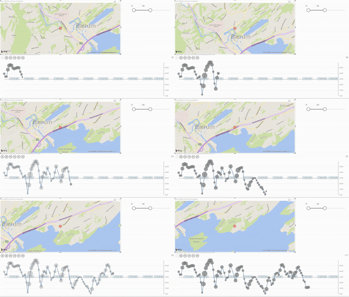
Picture: Play a trip in PowerBI, with map and engine RPM.
- X-axis: time
- Y-axis: speed (from GPS)
- Size of the bubble: Engine RPM (from OBD)
It clearly shows where was the traffic jam (drops of speed), and where had a good traffic condition (peak of speed and RPM).
4.4 Summary of PowerBI experience
Pro:
- Easy to use
- Rich visualization (e.g. map)
- Easy to share (e.g. PowerBI Online)
Con:
- Not for big data computing, but good for visualization
- Need a “big data computing” back end (in our case it is ADX)
5. Grafana
PowerBI is a good visualization tool, but it is not easy to directly create/update kusto query in PowerBI. Most likely you will have to run and test the query in ADX, then export to PowerBI. We hope to overcome this issue with Grafana.
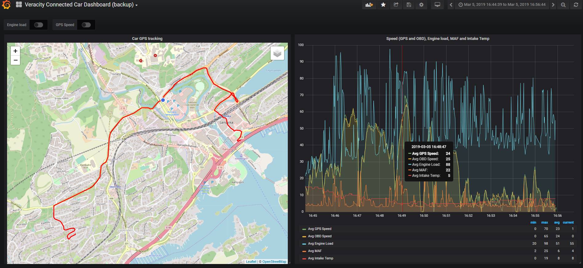
Grafana is an open source tool mainly used for monitoring and data visualization. With the Azure Data Explorer Datasource For Grafana plugin, we can integrate the ADX and Kusto power with fancy and powerful Grafana visualization.
5.1 Run Grafana as docker, with preinstalled ADX data source plugin
1 | docker run -p 3000:3000 -e "GF_INSTALL_PLUGINS=grafana-azure-data-explorer-datasource" grafana/grafana:latest |
Then follow the plugin documenation to config access.
Now you can directly create Kusto-enabled dashboard, including map.
5.2 Summary of Grafana experience
Pro:
- Very rich and powerful visualization
- Self-service Kusto enabled queries and build dashboard
- Built-in access control and notification support
- Big support by the community
Con:
- (cannot find one…for now)
Conclusion
Now we have tried several products, and my favorite setup is ADX (as backend data storage and query) and Grafana (as front end self-service visualization). I believe it meet the most common needs of ordinary users. But of course other products have different focus areas and can/should be used for different scenarios.
After all, the old saying is always correct: “It depends.”
Thanks for the reading.
(Read Part 1 of this article series)